Here is an Art Deco style of graphic design that is exemplifies depth, scale and space. The first thing that I noticed was scale. If you take a look at the actual size of the characters they are different sizes. The one that is larger give the effect of being closer. The one that farther back appears to be further back in the page. There is also on that sits in between them. There are other elements that represent depth. Overlapping is being used in this design piece. It starts with the rays of light that appear to be in the back of this design. By placing buildings and people in front of these rays gives the feeling of depth. Another characteristic that shows this idea of depth/space is the hue and color. As the rays get closer to the building the hue begins to demising. Also if you loot at the first, and larger, character silhouette it is darker that the ones that are in smaller scale to the left of it. This design is also using one point linear perspective which is also creating dimension and depth.
Saturday, October 23, 2010
Wednesday, October 20, 2010
Week 8 Tone and Color
TONE
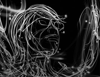
Tone in this design is just another Visual language element, like movement and texture. In this example it is using tone and color, which are considered to be relatively the same thing, to convey a message. The colors being used in this graphic are quite saturated. They are sending out this message of high energy and activity. His choice of color and tone are contrasting to the background color of black which is creating this push and pull relation between the figure in the foreground and the background. If you look at the black and white picture below the colored picture you will see how much the tone/color in the lines stick out from the background. Tone also deals with the content around the actual lines. The black background, if it were to be changed to grey would create a complete different feel. The tone of the background is also what makes this design so dramatic. It would not convey the same message if it were be a blue background or a green background. the contrast between the lines and the colored lines are also conveying this dramatic feeling. The colors being green and red are honing in on our medium and long cones. As a side note, these saturated colors of lines in the picture look much different when seen through the eyes of different animals. The designer of this chose to use analogous colors from the color wheel.
Tuesday, October 12, 2010
Saturday, October 2, 2010
Week 6 Syntactical Guidelines
Here is an artist that I have been following for about 5-6 years. He goes by the name of Shepard Fairey, but his companies, and more widely known name, Obey. He uses some Syntactical guidelines as he constructed this design. The first thing that I noticed was how balanced this design is. This design is quite structured and symmetrical. His design is leveled and gives an overall sense of calmness. He uses an all black background creating this positive and negative space relationship. The black area being the negative space and the beige being the foreground. He also developed this pattern like quality by repetition. His patterns are forcing our eyes to group each "ring" as an individual piece.
Here is my example of poor design. The text reads "foundation", which is a slight contradiction to what the graphics are telling me in this design. First off, the definition of foundation is as follows: "the natural or prepared ground or base on which some structure rests." Besides being unsymetrical, this design is highly sharpened as the black tree, and the focal point of my eye, is weighted heavily in the lower right hand corner. None of these things make me feel like a foundation is being, or going to be, built. There is an active diagonal direction created by the black tree to the right. This is creating stress in the design. THe design is weighted heavy towards the bottom of the page creating this unbalance composition. Unfortunately, none of these things make me feel like a foundation is being, or going to be, achieved.
Here is my example of poor design. The text reads "foundation", which is a slight contradiction to what the graphics are telling me in this design. First off, the definition of foundation is as follows: "the natural or prepared ground or base on which some structure rests." Besides being unsymetrical, this design is highly sharpened as the black tree, and the focal point of my eye, is weighted heavily in the lower right hand corner. None of these things make me feel like a foundation is being, or going to be, built. There is an active diagonal direction created by the black tree to the right. This is creating stress in the design. THe design is weighted heavy towards the bottom of the page creating this unbalance composition. Unfortunately, none of these things make me feel like a foundation is being, or going to be, achieved.
Subscribe to:
Comments (Atom)


