TONE
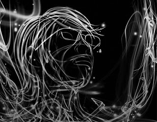
Tone in this design is just another Visual language element, like movement and texture. In this example it is using tone and color, which are considered to be relatively the same thing, to convey a message. The colors being used in this graphic are quite saturated. They are sending out this message of high energy and activity. His choice of color and tone are contrasting to the background color of black which is creating this push and pull relation between the figure in the foreground and the background. If you look at the black and white picture below the colored picture you will see how much the tone/color in the lines stick out from the background. Tone also deals with the content around the actual lines. The black background, if it were to be changed to grey would create a complete different feel. The tone of the background is also what makes this design so dramatic. It would not convey the same message if it were be a blue background or a green background. the contrast between the lines and the colored lines are also conveying this dramatic feeling. The colors being green and red are honing in on our medium and long cones. As a side note, these saturated colors of lines in the picture look much different when seen through the eyes of different animals. The designer of this chose to use analogous colors from the color wheel.


No comments:
Post a Comment